Project 1
Redesigning the d6 Payments Experience

d6 is one of South Africa's leading school communication apps, serving thousands of parents, schools, and administrators.
About
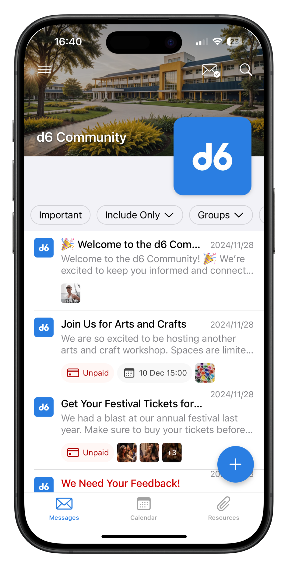
d6 is a school communication platform with two core products: d6 Communicator and d6+. Each had its own app, which caused confusion for parents who often downloaded the wrong one. To fix this, d6 launched a unification project in early 2024 to standardise both apps. While both remained on app stores, they were updated to support the same features. d6 Connect’s outdated technology and scalability issues led to its functionalities being merged into d6 Communicator, creating a single, reliable solution. The old d6 Connect app was deprecated August 2024.
From this

To this
The Challenge
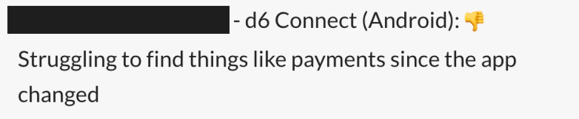
Within the first month of the d6 Connect app's rollout, 35% of the negative feedback specifically highlighted issues with how payments were handled. While the new app retained all the payment features of the previous version, the process was unintuitive, leaving parents confused and frustrated.
Given the critical importance of clear and seamless financial interactions, these issues began to erode trust in the platform. Resolving this problem quickly became a top priority to restore user confidence and improve the overall experience.
My Role
In this project, I led the end-to-end product design process, collaborating closely with a product manager, developers, and stakeholders. My role included:
Conducting user research through interviews to uncover pain points.
Developing user flows and low-fidelity wireframes to explore solutions.
Running usability testing to validate the final design and incorporating user feedback into refinements.
My Approach
User Research: Conducted interviews, reached out to parents that gave feedback and did usability tests to understand parents’ frustrations.
Collaboration: Partnered with developers, stakeholders, and customer support teams to align on technical feasibility and business goals.

Problem Analysis: Identified key pain points, including the lack of a centralized view of payments and inconsistent flows across the app.
Iterative Design: Leveraged insights from the legacy app while creating a streamlined, unified payment solution that ensured clarity, consistency, and ease of use.


A User Story Emerged
“As a parent, I want to quickly access and view any payment-related messages, so that I can easily keep track of what needs to be paid without losing them among other school messages.
I want to know what I need to pay, what I can pay later, what I don’t have to pay and what payments I have made”
The Solution
This is one of the first iterations tested in the market.

It had:
A payments tab
Items that still needs to be paid
Items that can be ignored
Items that were paid
After the initial iteration, the feedback received was very positive, confirming that the design was on the right track. At this stage, my focus shifted to refining the UI to enhance the overall user experience.
The Final Design
The Final Design
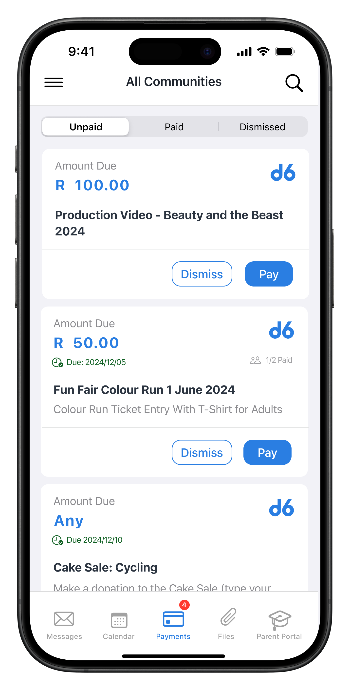
The final design included a dedicated payment tab with a segmented control to separate the unpaid, paid and dismissed payments from each other.
Impact
This project was initiated in August 2024 and is scheduled for public release by the end of January 2025. Currently, the feature has been rolled out internally and to a select group of users as part of a phased approach. Early feedback from this group has been highly encouraging, with parents highlighting the improved ease of managing payments.
The new solution is designed to reduce user confusion and increase satisfaction by streamlining the payment process. Once fully launched, we aim to measure success through key metrics such as a reduction in support queries related to payments, increased payment completion rates, and improved user satisfaction scores.